
Most estate agency CGI problems trace back to seven recurring mistakes: vague briefs, missing source files, wrong viewpoints, over-styled imagery, sloppy scale accuracy, incomplete delivery specs, and rushed approval cycles. Each one carries a different cost. A vague brief triggers endless revisions. Over-styled imagery invites planning objections or buyer disappointment when the finished building doesn’t match the render. Wrong technical scale can get a visual rejected outright by a planning officer. Read on for the full commissioning checklist that prevents all seven.
Key Takeaways
Most estate agency CGI failures come from treating planning and sales imagery as the same product, when they require different briefs, viewpoints and verification standards entirely.
| Point | Details |
|---|---|
| Separate planning from sales | Never let one image try to satisfy both a planning officer and a house-hunter. |
| Brief before design freezes | Commission once the design is stable enough to brief clearly, but before deadlines tighten. |
| Supply complete source files | Current plans, models and surveys prevent guesswork and rework. |
| Verify scale for planning submissions | Use verified photomontage aligned to survey data wherever a local authority requires accurate context. |
| Choose Visualtrick for purpose-led CGI | Visualtrick runs planning-ready visuals and sales imagery as distinct workstreams from the first brief. |
Table of Contents
- Common estate agency CGI mistakes that derail projects
- Why unclear briefs and late commissioning cause scope creep
- Missing source files and the errors they cause
- Viewpoint and camera mistakes that undermine planning or sales
- Over-styling and misleading presentation
- Technical errors in scale, lens choice and measurement tolerance
- Delivery mistakes: missing sizes, wrong formats, no layered files
- The commissioning checklist that prevents these mistakes
- Approval and revision workflow that keeps costs down
- Common pitfalls in post-processing and retouching CG images
- Why consistent branding and style guidelines matter in estate agency CGI
- CGI cost versus value: where budgeting goes wrong
- Communication breakdowns between agents and CGI artists
- Legal considerations and disclaimers for CGI accuracy
- What separates a reliable CGI partner from a risky one
- Get planning-ready CGI without the guesswork
- Sources
Common estate agency CGI mistakes that derail projects
Every one of these mistakes stems from the same root cause: nobody stopped to ask whether the image was being built for a planning committee or a house-hunter, and those are two entirely different jobs.
- Commissioning too early, before the design is stable — leads to repeat revisions as details change underneath the visual.
- Sending incomplete or outdated source files — forces the studio to guess at fenestration, rooflines and levels.
- Choosing viewpoints without consultant input — produces images that look good but fail planning scrutiny or misrepresent the scheme.
- Over-styling with exaggerated lighting or mature landscaping — sets buyer expectations the finished property can’t meet.
- Ignoring scale, lens and measurement tolerance — invalidates a visual for formal planning submission.
- Skipping output specifications — causes last-minute re-renders when a file won’t print or fit a hoarding.
- Rushing the approval workflow — compresses revision time into the final week and inflates cost.
The good news is that every one of these is preventable with a properly structured brief, which is exactly what the commissioning checklist further down this article sets out.
Why unclear briefs and late commissioning cause scope creep
A brief that doesn’t state its purpose is the single biggest cause of wasted revisions. If a studio doesn’t know whether an image needs to satisfy a planning officer or sell a two-bedroom flat off-plan, it will guess, and guesses cost time.
A complete brief states four things clearly:
- Purpose — planning submission, sales brochure, investor pitch, or website listing.
- Audience — planning committee, prospective buyers, joint venture partners, or the general public.
- Outputs — how many images, what formats, and where they’ll appear.
- Deadlines — including any statutory planning submission date.
Commissioning before the design is stable is almost as damaging as a vague brief. Every subsequent design change ripples through the visual, and each ripple costs a revision cycle. Requesting a quote once the scheme is developed enough to brief clearly, but before deadlines are fixed, keeps timing and cost under control rather than fighting fires in the final fortnight.
Missing source files and the errors they cause
CGI studios build images from data, not imagination. When that data is incomplete, the finished visual inherits the gaps.
The essential file set includes:
- Plans, elevations and sections at current revision
- Revit, DWG, SketchUp or FBX exports where available
- Material and finish schedules
- Landscaping drawings and boundary information
- Site surveys, aerial imagery or LiDAR scans where the context matters
Missing or outdated drawings, models and survey data are a recurring cause of errors and rework across visualisation projects, because studios fill gaps with assumptions that don’t always match reality. The typical failures are predictable: window positions that don’t match the latest elevations, rooflines pulled from an earlier design iteration, or ground levels that ignore a recent topographical survey.
Pro Tip: Before sending files, check that every drawing carries the same revision number and date. A studio working from two different design versions at once is the fastest route to a visual that needs rebuilding.
Viewpoint and camera mistakes that undermine planning or sales
A viewpoint chosen for a striking composition and a viewpoint chosen to satisfy a planning officer are rarely the same shot, and confusing the two causes real problems.
Planning-focused views need to show honest context: how the building sits against neighbouring properties, how it reads from the street the committee will actually walk down, and how it compares to existing massing. Sales views can be more emotive, angled to flatter a facade or dramatise a skyline. Camera viewpoints should be chosen with a strategic purpose in mind, and ideally in consultation with the project’s planning consultant or architect rather than left to aesthetic preference alone.
Common viewpoint errors include:
- Selecting angles purely for visual drama with no planning consultant sign-off
- Cropping out constraints such as boundary lines, overshadowing, or adjacent structures
- Using a camera height or field of view that distorts perceived scale
- Reusing a sales viewpoint for a planning submission, or vice versa
Decide who approves viewpoints before production starts. For planning work, that should be the architect or planning consultant. For sales imagery, the marketing lead has more latitude, but should still sense-check against what the finished property will realistically look like.
Over-styling and misleading presentation
Exaggerated lighting, unrealistically mature planting and enhanced material finishes make an image more attractive and more risky at the same time. A render showing ten-year-old trees on a development that’s about to plant saplings sets an expectation nobody can meet on completion day.
Planning-focused visuals should avoid exaggeration and present the scheme honestly, because a committee that feels misled by an overly flattering image is more likely to scrutinise the application harder, not less. The same logic applies, in a softer form, to sales: buyers who feel a finished flat doesn’t match the marketing render are the ones who leave the negative reviews.
Common over-styling mistakes:
- Golden-hour lighting on every image regardless of actual orientation
- Landscaping shown at full maturity years ahead of realistic growth
- Material finishes upgraded beyond the approved specification
Reserve the polished, lifestyle-led treatment for sales and marketing collateral, and insist on technical accuracy, including realistic planting age and true-to-spec materials, for anything heading to a planning department.
Technical errors in scale, lens choice and measurement tolerance
Scale mistakes are the ones that get a visual rejected rather than just criticised. A camera height that’s a few degrees off, or a lens choice that subtly compresses distance, changes how large a building appears relative to its surroundings, and planning officers notice.
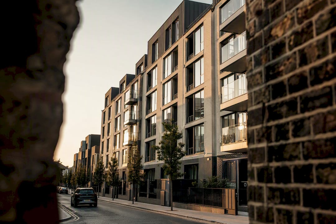
Professional interior renders are expected to hold dimensional accuracy within a tight tolerance, often cited around ±15cm, so that buyers correctly judge whether furniture will actually fit. Exterior work carries the same discipline: get the lens or camera height wrong and a three-storey block can read as four, or a garden can look twice its real depth.
Where a local authority requires context-accurate imagery, verified photomontage aligned to survey data becomes necessary rather than optional, particularly on sites where levels, boundaries or neighbouring buildings are contentious. Skipping that step on a sensitive application is one of the more expensive mistakes on this list, because it usually means resubmitting.
Delivery mistakes: missing sizes, wrong formats, no layered files
An image that looks perfect on screen can still fail at the point of use if nobody specified the output requirements upfront. Print needs a different resolution to web. A hoarding needs a completely different crop to a brochure spread.
Get ahead of this by specifying:
- Print-ready files at the correct DPI for the intended format
- Web-optimised sizes for listings and social media
- Cropped formats for site hoardings or exhibition boards
- Layered PSD or EXR files if in-house teams need to retouch or relight later
Agreeing image sizes and output formats at the briefing stage avoids the scramble of a late re-render because nobody mentioned the file needed to fit a 6-metre hoarding. Put these specifics in writing before production starts, not after the first draft lands.
The commissioning checklist that prevents these mistakes
Run through this before any brief goes out, and assign a named sign-off for each stage.
- Confirm the primary purpose — planning submission or sales marketing, never both from one image.
- Name the audience and approver — planning consultant, marketing lead, or both.
- Attach current-revision files — plans, models, surveys, material schedules.
- Agree viewpoints with the relevant consultant before production begins.
- Specify output formats and sizes for every intended use.
- Set a realistic revision allowance — typically two structured rounds.
- Fix the final approval deadline, working backwards from any statutory date.
Agreeing audience, output, viewpoint, file format and approval route before production begins is the single habit that prevents most of the mistakes covered above.
Pro Tip: Build in one extra week beyond your “needed by” date for a second revision round. Almost every project uses it, and the ones that don’t just finish early.
Approval and revision workflow that keeps costs down
Most cost overruns on CGI projects don’t come from the render itself. They come from an approval process that nobody structured properly. When feedback arrives piecemeal, a stakeholder here, a planning consultant there, three weeks apart, a studio ends up making the same change repeatedly because each round contradicts the last.
The fix is to consolidate feedback into structured rounds rather than a drip feed. Nominate one person to gather comments from every stakeholder, planning consultant, architect, marketing lead, before sending a single consolidated response back to the studio. Two structured revision rounds, each with all feedback gathered in advance, will almost always beat five scattered ones for both speed and final quality.
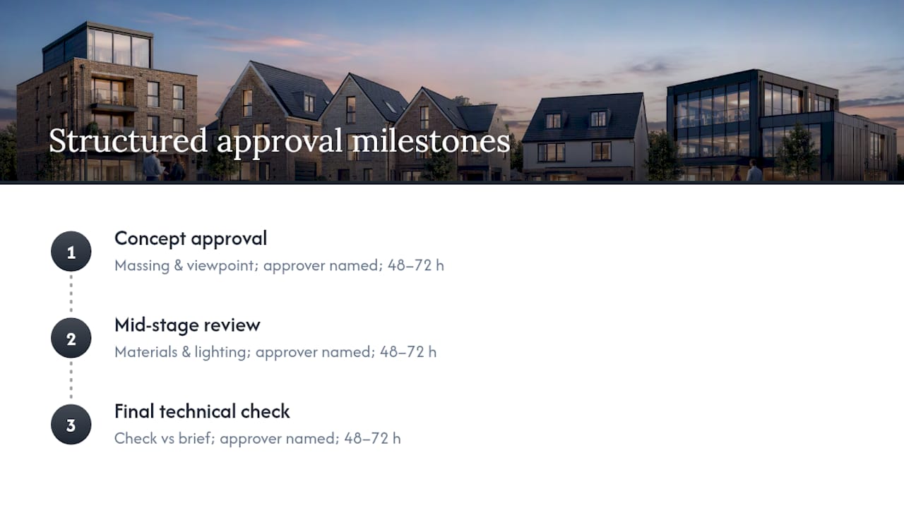
Set the milestones before work starts, not after the first draft lands. A typical structure looks like: concept approval on massing and viewpoint, a mid-stage review of materials and lighting, and a final technical check against the brief. Each milestone needs a named approver and a turnaround deadline, ideally 48 to 72 hours, so the studio isn’t left waiting on a decision while the clock runs on a planning deadline.
Change control matters just as much as the review schedule. If a design changes after visuals are underway, that’s a new instruction, not a free amendment to the existing brief. Agreeing this distinction upfront, before the first invoice, prevents the awkward conversation later about why extra revisions cost more than expected. Most disputes over CGI pricing come from this exact ambiguity rather than from the render quality itself.
Common pitfalls in post-processing and retouching CG images
The render itself is rarely where things go wrong. Post-processing is where a technically accurate image quietly drifts into misleading territory, often without anyone intending it to.
Over-sharpening and aggressive colour grading are the most common culprits. A render pushed through heavy contrast and saturation adjustments in post can end up looking more like a video game than a photograph, undermining the credibility a planning-focused image needs. The same over-processing on a sales image can make finishes look richer than the actual specification, which is exactly the kind of gap buyers notice on completion.
Compositing errors are the second recurring issue: shadows that fall in the wrong direction relative to the building’s actual orientation, reflections that don’t match the surrounding context, or people and vehicles added at a scale that subtly distorts the perceived size of the building behind them. These aren’t always deliberate manipulation. They’re often just a retoucher working from a stock asset library without cross-checking it against the site’s real conditions.
Retouching without reference to the original technical brief is the underlying problem in most of these cases. A postwork pass should be checked against the same brief that governed the render, purpose, audience, and technical tolerance, rather than treated as a purely aesthetic final polish. If layered files were requested at the delivery stage, an in-house team retouching later has the means to make corrections without asking the original studio to start again from scratch.
Why consistent branding and style guidelines matter in estate agency CGI
A property portfolio that uses five different visual styles across five different developments looks like five different developers, not one. For an estate agency or developer marketing multiple sites simultaneously, that inconsistency undermines the professional credibility each individual image is trying to build.
Consistent branding in CGI means agreeing a visual language once, colour treatment, typical time of day, camera angles, level of landscaping detail, and applying it across every commission regardless of which studio or artist produces the final image. Buyers comparing developments side by side notice when one looks warm and lived-in while another looks cold and clinical, even if both are technically accurate.
This matters just as much internally as externally. A style guide handed to every studio a developer works with, specifying preferred lighting mood, typical staging approach for interiors, and even standard camera heights for exterior shots, saves enormous back-and-forth on every new commission. Without one, each new project effectively restarts the aesthetic conversation from zero, and revision rounds get spent debating style rather than substance.
The practical fix is a short brand style document, two or three pages covering lighting preference, material treatment expectations, and example reference images, attached to every brief regardless of which project it covers. It costs almost nothing to produce and pays for itself on the second commission onwards.
CGI cost versus value: where budgeting goes wrong
The most expensive CGI mistake isn’t a badly rendered image. It’s choosing the cheapest quote without understanding what’s excluded from it, then paying for the gap later through rework, delay, or a resubmitted planning application.
Budgeting errors typically follow one of two patterns. The first is treating CGI as a single line item with one flat price, when in reality cost scales with viewpoint count, revision rounds, verified photomontage requirements, and file format complexity. A quote for three sales images and a quote for one verified planning photomontage aligned to survey data are not comparable, even if the headline number looks similar.
The second pattern is underestimating the cost of revisions caused by an incomplete brief. A cheap initial quote based on minimal information often balloons once the studio starts asking for the plans, surveys, and viewpoint approvals that should have been supplied at the outset. The saving on the quote gets eaten by the extra rounds needed to compensate for missing groundwork.
The better framing is to treat CGI spend as risk mitigation rather than a marketing cost alone. A planning-ready visual that survives committee scrutiny first time round is worth considerably more than a slightly cheaper one that triggers a request for further information and pushes a submission back by weeks. Ask any quote to break down what’s included, viewpoint count, revision rounds, verified photomontage if needed, and file deliverables, so the comparison between studios is actually a comparison of like for like.
Communication breakdowns between agents and CGI artists
Most of the errors covered in this article trace back to one root cause: the person commissioning the CGI and the person producing it don’t share the same mental picture of the finished image, and nobody caught the mismatch until the first draft arrived.
This usually happens because feedback gets relayed rather than given directly. An estate agent tells a marketing coordinator what they want, who relays it to a project manager, who briefs the studio, and by the fourth link in that chain the original intent has shifted. A request for “a warmer feel” becomes an entirely different lighting setup by the time it reaches the artist.
Vague feedback language compounds the problem. Terms like “make it pop” or “more premium” mean different things to different people and give a studio nothing concrete to act on. Feedback that references a specific comparable image, a competitor development, a previous project, or an annotated screenshot with marked-up changes, closes that gap far faster than descriptive adjectives ever will.
The most reliable fix is a single named point of contact on the client side who has the authority to approve changes without checking back with three other stakeholders each round. Studios lose more time waiting for consolidated feedback than they do actually making changes, and every extra person in the approval chain adds a delay that compounds across every revision round.
Legal considerations and disclaimers for CGI accuracy
CGI used in property marketing sits in a legal grey area that catches out agents who treat it as pure creative licence. An image that materially misrepresents a property, exaggerating room dimensions, omitting a neighbouring structure that will affect light, or showing landscaping that will never exist, can expose an agent or developer to claims of misleading advertising under consumer protection law.
The practical safeguard is a clear disclaimer stating that CGI images are indicative and subject to change, positioned visibly on any marketing material that uses them. That disclaimer doesn’t excuse deliberately misleading imagery, but it does set a reasonable expectation for a viewer that the final property may differ in some respects, particularly around finishes, landscaping maturity, and furniture staging.
Planning applications carry a stricter standard again. A local authority relies on submitted visuals to assess genuine impact, so a CGI image that downplays overshadowing, omits a boundary constraint, or exaggerates a positive angle isn’t just poor practice, it can undermine the credibility of the entire application if a planning officer or objector spots the discrepancy. This is precisely why verified photomontage, aligned to actual survey data rather than an approximate model, exists as a distinct service for the visuals that matter most.
Agents and developers should ask their studio directly whether verified views are required for a given submission, and should never assume a general-purpose sales render is fit for planning use without that verification step.
What separates a reliable CGI partner from a risky one
The gap between a well-run CGI project and a chaotic one rarely comes down to rendering talent. It comes down to whether the studio treats planning work and sales work as genuinely different disciplines rather than the same product with a different filter applied. Visualtrick builds planning-ready visuals and marketing imagery as separate workstreams, each with its own brief, viewpoint logic and verification standard, which is precisely the distinction most of the mistakes in this article stem from ignoring.
A studio that asks the right questions at the outset, purpose, audience, whether verified photomontage is needed, catches most of these errors before a single frame is rendered.
— Paride
Get planning-ready CGI without the guesswork
Visualtrick separates planning visuals from sales imagery from the first conversation, so you’re never trying to make one image satisfy a committee and a buyer at the same time. That distinction alone removes the cause of most of the mistakes covered above.
Whether you need verified photomontage for a planning submission or emotive imagery for a sales launch, the studio’s architectural visualisation services cover both as distinct deliverables rather than one compromised middle ground. Estate agents working on new listings will find the same purpose-led approach in Visualtrick’s property CGI work, built to hold up under buyer scrutiny rather than just looking good in a thumbnail.
To get an accurate quote, include your project’s purpose, audience, current drawings, and target deadline in your first enquiry. That’s enough for Visualtrick to scope viewpoints, revision rounds and file deliverables properly from day one, rather than guessing and revising later. Get in touch through Visualtrick’s studio to start that conversation.
