
Visualisation is defined as the use of 3D renderings, CGI, infographics, and architectural graphics to communicate project intent within investment documents. The visualisation benefits for joint venture proposals are measurable: proposals with professional visuals receive 35% more investor engagement and score 15–25% higher on technical evaluations. These are not marginal gains. For property developers competing for capital in a crowded market, they represent the difference between a shortlisted proposal and one that never gets a second read. Architectural visualisation, the recognised industry term for this discipline, has moved from optional enhancement to core proposal component.
1. How visualisation increases investor engagement in joint venture proposals
The cognitive case for visuals is well established. People process visual information 60,000 times faster than text and recall 80% of what they see, compared to 20% of what they read. That gap matters enormously when an investor is reviewing a stack of competing proposals under time pressure.
Evaluator fatigue is real. A proposal that relies entirely on dense financial text forces the reader to do all the interpretive work. Visuals shift that burden by presenting complex site data, phasing plans, and return structures in a format the brain absorbs quickly.
“Graphics act as visual chapters in proposals. Each one must have a clear purpose: to reduce cognitive load, differentiate the offer, and help evaluators score with confidence.”
Investors reviewing multiple proposals favour those that shift technical explanation into immersive storytelling. A well-placed aerial CGI or phasing diagram does not just illustrate. It holds attention and builds momentum through the document.
2. Visualisation as strategic risk management

Investors do not just evaluate returns. They evaluate the team’s ability to deliver. 3D architectural visualisation mitigates perceived execution risk by showing layout, materials, and environmental context with clarity that written descriptions cannot match.
The cognitive gap between a vacant brownfield site and a completed residential scheme is enormous. A photorealistic CGI closes that gap. It lets the investor see the finished asset, understand its relationship to the surrounding streetscape, and assess its market positioning without relying on imagination.
Investors interpret high-quality visuals as a proxy for operational competence. A developer who presents polished, accurate renderings signals that they have thought the project through in detail. The inverse is equally true.
Pro Tip: Commission site-specific CGI rather than repurposing visuals from previous schemes. Investors notice when a rendering does not match the actual plot, and it raises questions about attention to detail.
Poor or generic visuals actively damage proposals. Stock or generic images increase cognitive load and introduce doubt. Each graphic must earn its place by proving a specific capability or clarifying a specific risk.
Key risks that visualisation addresses directly:
- Execution uncertainty: Renderings show the finished scheme, not just the concept.
- Site context doubt: Aerial views and streetscape CGI place the development in its real environment.
- Scale misreading: Floor plans and section drawings prevent investors from misinterpreting unit sizes or densities.
- Market positioning gaps: Interior CGI communicates the target buyer or tenant profile without lengthy written description.
3. The best visualisation types for joint venture proposals
Not all visuals carry equal weight. The format you choose should match the information you are trying to communicate and the audience receiving it.
AI-powered 3D architectural visualisation reduces rendering costs by up to 80% and compresses delivery from weeks to minutes. That speed advantage matters when proposals have tight submission windows or when a developer needs to iterate quickly after investor feedback.
Infographics work best for process-heavy content: phasing timelines, planning consent routes, profit waterfall structures, and team organograms. They replace paragraphs of explanation with a single scannable image. The pre-construction marketing visual examples that perform best in 2026 combine photorealistic CGI with clean data graphics rather than relying on either format alone.
Pro Tip: Plan your visual hierarchy before writing the proposal. Decide which three or four images carry the most weight, then build the written narrative around them rather than adding visuals as an afterthought.
| Visual type | Best use in proposals | Relative cost | Impact on evaluators |
|---|---|---|---|
| 3D exterior CGI | Site context, massing, streetscape | Medium to high | Very high |
| Interior CGI | Unit quality, specification level | Medium | High |
| Aerial / drone CGI | Site location, access, surroundings | Medium | High |
| Infographic | Timelines, structures, processes | Low to medium | Medium to high |
| Floor plans | Layout, unit mix, density | Low | Medium |
| Phasing diagrams | Programme, milestones, risk stages | Low | Medium |
Avoid the following in joint venture proposals:
- Generic stock photography that does not represent the actual site or scheme.
- Overly stylised renders that prioritise aesthetics over accuracy.
- Unlabelled diagrams that require the reader to cross-reference written text.
- Inconsistent visual styles that suggest different teams produced different sections.
4. How to integrate visuals effectively into your proposal
Placement and purpose matter as much as quality. A strong CGI buried on page 34 does less work than a clear infographic positioned directly alongside the relevant evaluation criterion.
Follow this sequence when planning visual integration:
- Map your evaluation criteria first. Identify every scored section and ask what visual evidence would strengthen each answer.
- Assign a visual to each key claim. Every major assertion about the scheme, the team, or the returns should have a corresponding graphic.
- Write action captions. Visuals tied to evaluation criteria and accompanied by action captions help evaluators process information and reinforce win themes. A caption that reads “Phase 1 completions deliver 22% IRR by month 18” does more work than “Artist’s impression.”
- Maintain a consistent visual identity. Use the same colour palette, font, and graphic style throughout. Inconsistency signals a lack of coordination.
- Test for cognitive load. If a single page contains more than two visuals, consider whether each one is genuinely necessary. Clutter undermines the clarity you are trying to create.
- Use planning visuals that meet professional standards. Visuals prepared to planning-grade accuracy carry more credibility with sophisticated investors who understand the development process.
The storyboard approach works well for larger proposals. Before writing a single word, map out the visual journey through the document. Decide which images appear on which pages and what each one must communicate. Writing then becomes the task of supporting those visuals rather than the other way around.
5. When professional visualisation is essential versus optional
Deal size and competitive context determine how much visual investment is justified. For joint ventures above £10m, professional visualisation is a strategic necessity, not a discretionary spend. Investors at that level expect it. Arriving without it signals either inexperience or underinvestment in the deal.
Situations where professional CGI and architectural visualisation are non-negotiable:
- Schemes above £10m where institutional or high-net-worth investors are involved.
- Competitive capital raises where multiple developers are pitching for the same equity.
- Pre-construction proposals where no physical asset exists to inspect.
- Schemes in sensitive planning contexts where visual impact is a key concern.
- Proposals targeting overseas investors unfamiliar with the local market.
Smaller or less complex proposals can sometimes use internally produced graphics effectively, provided the quality is consistent and the visuals are purpose-built for the document. The risk is that internal resources rarely produce output that matches the credibility of professionally commissioned architectural visualisation services.
Visualisation complements financial and legal documentation. It does not replace it. The strongest proposals use visuals to make the financial case easier to understand, not to distract from weak fundamentals. An investor who is drawn in by a compelling CGI will still scrutinise the numbers. The visual simply ensures they get that far.
For effective investor pitch visuals, the principle is the same across markets: clarity and credibility come before style.
Key takeaways
Professional visualisation is the single most effective tool for increasing investor engagement and evaluation scores in joint venture proposals.
| Point | Details |
|---|---|
| Visuals increase engagement | Proposals with professional visuals receive 35% more investor engagement and score 15–25% higher on technical evaluations. |
| Cognitive science supports visuals | People recall 80% of what they see versus 20% of what they read, making visuals the most efficient communication format. |
| Quality signals competence | Investors treat high-quality renderings as evidence of operational capability and project readiness. |
| Every visual must earn its place | Generic or stock visuals add cognitive load and reduce evaluator confidence rather than building it. |
| Integration beats decoration | Visuals tied directly to evaluation criteria and supported by action captions produce the strongest scoring outcomes. |
Why visuals are the argument, not the decoration
I have reviewed a significant number of joint venture proposals over the years, and the pattern is consistent. The proposals that win capital are not always the ones with the best returns on paper. They are the ones where the investor can see the project clearly from the first page.
The most common mistake I see developers make is treating visualisation as a finishing touch. They write the proposal, then ask someone to “add some images.” That approach produces visuals that illustrate rather than argue. The best proposals I have encountered are built around their visuals. The CGI comes first. The written narrative supports it.
There is also a quality threshold that has shifted noticeably in 2026. Investors who were once satisfied with basic floor plans and rough massing models now expect photorealistic exterior CGI, interior renders that communicate specification level, and infographics that make the financial structure scannable. That expectation will only increase as AI-driven rendering makes high-quality visuals faster and cheaper to produce.
The developers who treat visualisation as a core proposal discipline, not a marketing add-on, consistently outperform those who do not. That is not an opinion. It is what the engagement data shows.
— Paride
Visualtrick’s CGI services for joint venture proposals
Property developers who need proposal-ready visuals that meet investor expectations work with Visualtrick for exterior CGI, interior renders, and planning-grade architectural imagery. Every image is built to communicate clearly, accurately, and with the visual authority that competitive capital raises demand.
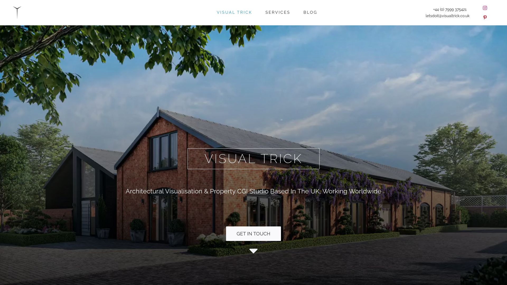
Visualtrick’s 3D rendering services cover everything from massing models to photorealistic scheme renders, produced at the speed and consistency that proposal timelines require. For developers preparing joint venture documents, the architectural visualisation services page sets out the full range of outputs available, from planning visuals through to investor-pitch CGI. Visualtrick works with developers across the UK and internationally, delivering visuals that are accurate, credible, and built for the audience that matters most.
FAQ
What are the main visualisation benefits for joint venture proposals?
Professional visualisation increases investor engagement by 35% and raises technical evaluation scores by 15–25%. It also reduces perceived execution risk by showing investors a clear, credible picture of the finished scheme.
What types of visuals work best in a joint venture proposal?
Photorealistic exterior CGI, interior renders, aerial views, and purpose-built infographics produce the strongest results. Each visual must serve a specific evaluative purpose rather than acting as general decoration.
How does visualisation reduce perceived risk for investors?
3D architectural renderings bridge the cognitive gap between a vacant site and a completed asset. Investors interpret high-quality visuals as evidence that the developer has planned the scheme in detail, which reduces uncertainty about execution.
When should a developer invest in professional CGI for a proposal?
Professional CGI is essential for joint ventures above £10m, competitive capital raises, and pre-construction schemes where no physical asset exists. Smaller proposals may use internal resources, but professional output consistently carries more credibility with sophisticated investors.
Do visuals replace financial documentation in a joint venture proposal?
Visuals complement financial and legal documentation. They make complex information easier to process and hold investor attention, but they do not substitute for sound fundamentals. The strongest proposals use both with equal rigour.
