
Visualisation in public realm design is the process of converting spatial data, design intent, and community aspiration into images, models, and interactive formats that non-specialists can read and respond to. Planners, architects, and local authorities rely on these tools to communicate proposals clearly, reduce misunderstandings, and build the public confidence needed to move projects forward. Techniques range from hand-drawn sketches and photomontages to Building Information Modelling (BIM), digital twins, and real-time 3D renders. Each method serves a different moment in the design process, and choosing the right one at the right stage is what separates projects that gain approval from those that stall in consultation.
How does visualisation in public realm design improve communication?
Visualisation tools close the gap between technical drawings and public understanding. A planning officer or community resident cannot reliably interpret a set of architectural elevations, but they can respond immediately to a photorealistic street-level render or an interactive walkthrough. That difference in comprehension directly affects how quickly a project moves through consultation and approval.
Integrating real-time data into visualisations improves space utilisation efficiency by 34.2% and pedestrian flow by 29%. Those gains come from replacing static assumptions with live conditions, so planners can test how a square performs at different times of day before a single brick is laid.
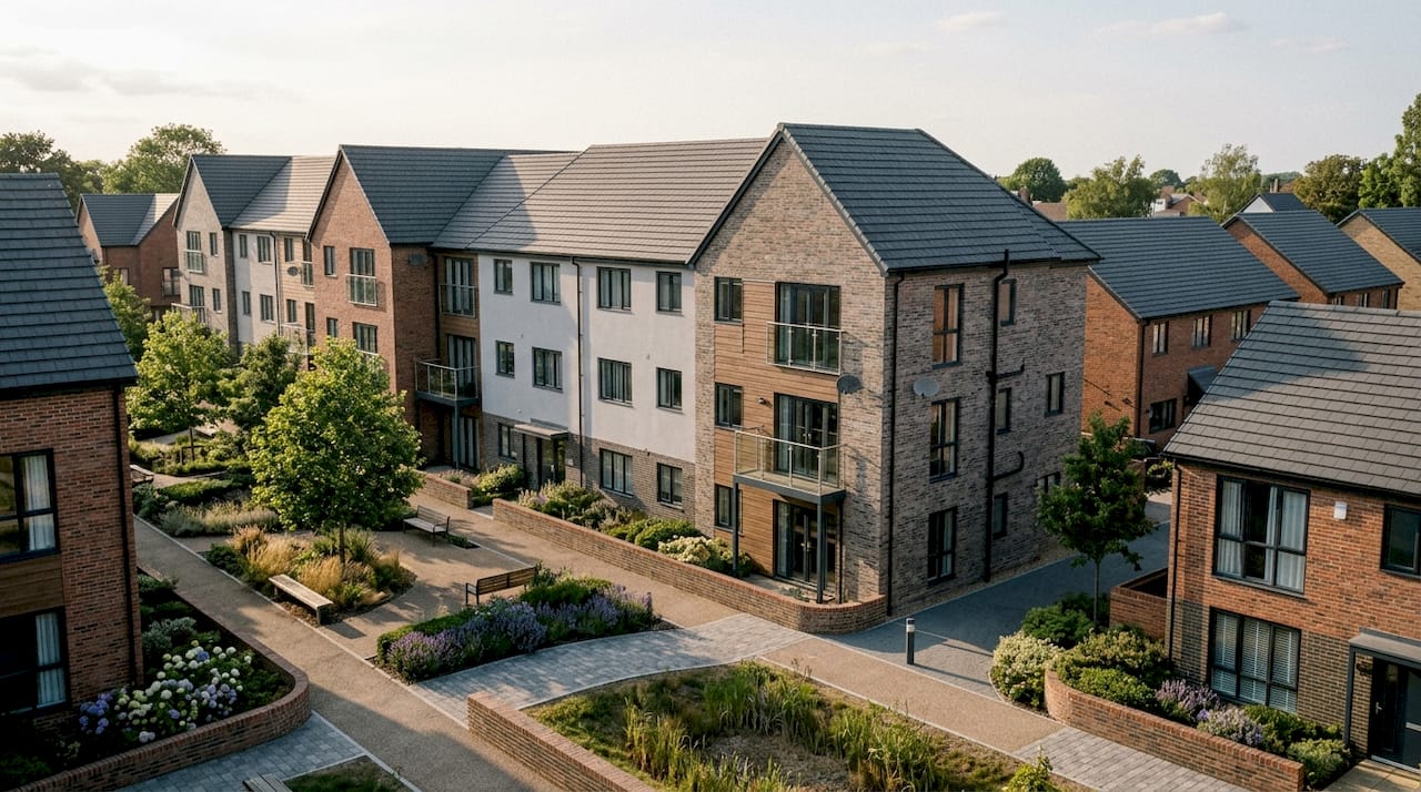
Digital twins take this further. They allow multiple stakeholders to interrogate the same model simultaneously, testing sightlines, sunlight access, and material choices without specialist software. 3D visualisation accelerates approvals by reducing revision cycles and improving design quality through clash detection and scenario testing. Fewer revisions mean lower costs and shorter timelines.
Key communication benefits of structured visualisation include:
- Shared reference point. All parties, from planners to residents, work from the same visual rather than different mental models.
- Faster sign-off. Realistic renders reduce the back-and-forth that delays planning committee decisions.
- Reduced legal risk. Accurate visuals limit the scope for post-approval disputes about what was agreed.
- Broader reach. Mobile-accessible models let stakeholders review proposals outside formal meetings, increasing participation rates.
Pro Tip: When preparing materials for a public consultation event, export your 3D model as a web-based viewer rather than a static PDF. Residents who can rotate and zoom a model ask more specific, constructive questions.
What impact do murals and colour strategies have on public spaces?
Structured visual interventions, such as murals and deliberate colour palettes, are not decorative afterthoughts. They are design tools that change how people perceive, use, and feel safe within a space.
A study of 268 participants found that murals increase public space usage by over 20% and significantly enhance spatial legibility across residential and campus-adjacent areas. The mechanism is straightforward: visual landmarks help people orient themselves, which reduces anxiety and encourages them to linger rather than pass through.
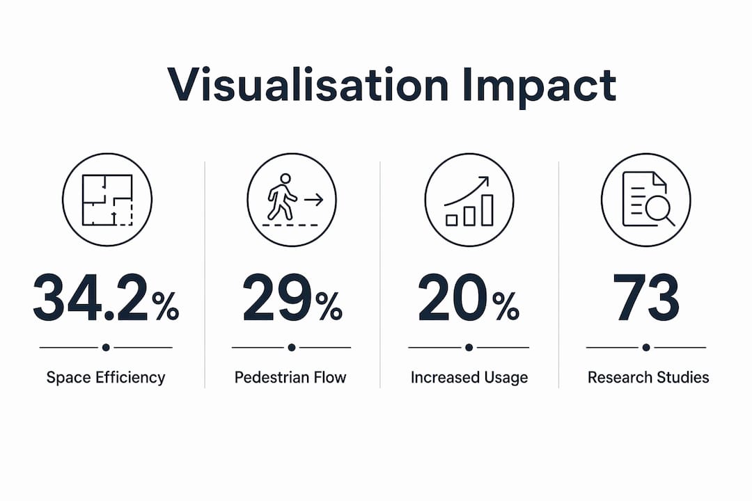
Colour strategy produces measurable effects on comfort and sustainability. Research synthesised from 73 peer-reviewed studies found that moderate colour complexity enhances perceived safety and comfort, with a median effect of β ≈ 0.43. Cool colour palettes can also reduce building energy use by 2–4% annually. That is a meaningful sustainability gain delivered through a visual decision rather than a mechanical one.
| Visual intervention | Primary effect | Secondary benefit |
|---|---|---|
| Murals and public art | Increased space usage (+20%) | Improved spatial legibility |
| Moderate colour complexity | Enhanced perceived safety (β ≈ 0.43) | Greater comfort and dwell time |
| Cool colour palettes | Reduced building energy use (2–4%) | Lower operational carbon |
| Vegetation in renders | Higher stakeholder satisfaction | Stronger community buy-in |
Understanding visual language strategies and how colour and composition shape perception is as relevant to public realm design as it is to brand communication. The underlying psychology is the same: people respond to what they see before they process what they are told.
Planners should treat colour and art placement as spatial decisions, not styling choices. A mural positioned at a pedestrian crossing reinforces a desire line. A cool-toned façade on a south-facing building reduces heat gain. These effects compound across a neighbourhood.
Which visualisation techniques work best at each design phase?
The right visualisation technique depends entirely on where a project sits in its lifecycle. Using a photorealistic render at the feasibility stage can actually harm a project by signalling that decisions are already made.
-
Feasibility and early engagement. Sketch-like visuals and loose diagrams are the correct choice here. Practitioners prefer early-stage visuals to be sketch-like because they signal flexibility and invite genuine feedback. A polished image at this stage closes down conversation rather than opening it.
-
Design development. Once the brief is fixed, transition to accurate 3D models with material, lighting, and landscape detail. Site analysis overlays showing sunlight paths, sightlines, and zoning boundaries belong at this stage. They give the design team the evidence needed to justify spatial decisions to planning authorities.
-
Public consultation. Interactive web-based models and photomontages placed within existing street photography are most effective here. They let residents compare the proposed scheme against what they already know. Planning visuals at this stage need to be accurate enough to be credible but accessible enough to be understood by a non-specialist audience.
-
Planning submission. Formal CGI renders, verified photomontages, and BIM-compliant drawings are required. These must meet the accuracy standards expected by local planning authorities and, in contested cases, planning inspectors.
-
Post-approval and marketing. High-resolution renders and animated walkthroughs serve a different audience: investors, future residents, and the press. The goal shifts from approval to aspiration.
Pro Tip: Label every render with its stage and date. Stakeholders who see an early sketch and a later render side by side understand that the design evolved in response to their input. That transparency builds trust.
What ethical considerations apply to public realm visualisation?
Visualisation is both a design tool and a political one. The choices made about camera angles, framing, and what to include or exclude shape not only how a scheme looks but also whether it gains approval.
Architectural renderings influence perceptions through camera angles, framing, and selective inclusion, shaping political outcomes as well as aesthetic ones. A render taken from a low viewpoint makes a building appear taller and more dominant. A render taken from across a park makes the same building appear contextual and modest. Neither is dishonest in isolation, but presenting only one framing to a planning committee is a form of selective communication.
Key ethical obligations for planners and designers include:
- Accuracy over aspiration. Renders submitted for planning approval must reflect the actual proposal, not an idealised version with extra trees and fewer cars.
- Contextual honesty. Neighbouring buildings, existing infrastructure, and shadow impacts must be represented accurately.
- Accessibility. Mobile optimisation of visualisation materials is critical because stakeholders often review them outside formal meetings. A PDF that is illegible on a phone excludes the very residents a consultation is meant to reach.
- Transparency of intent. State clearly what stage a visual represents and what decisions remain open.
“Visual tools augment the participatory planning toolbox but do not replace verbal communication. Overly polished visuals risk misleading stakeholders if they lack context about what stage of design they represent and what remains subject to change.”
The role of 3D visuals in planning public inquiries is well established, but that authority comes with responsibility. A visual that misrepresents a scheme, even unintentionally, can undermine trust in the entire consultation process.
Key takeaways
Visualisation in public realm design works because it translates complex spatial data into formats that planners, communities, and decision-makers can act on with confidence.
| Point | Details |
|---|---|
| Match technique to stage | Use sketch-like visuals early and realistic renders at consultation and submission stages. |
| Colour and art are design tools | Murals increase space usage by over 20%; moderate colour complexity measurably improves perceived safety. |
| Real-time data raises performance | Integrating live data into models improves space utilisation efficiency by 34.2%. |
| Ethics matter in every frame | Camera angle and content selection shape political outcomes, not just aesthetic ones. |
| Accessibility is non-negotiable | Visualisations must work on mobile devices to reach the full range of stakeholders. |
Why I think most teams use visualisation too late
From working across public realm projects of varying scale, the pattern I see most often is this: teams invest heavily in visualisation at the planning submission stage and almost nothing at the feasibility stage. That is the wrong order.
The decisions that determine whether a scheme succeeds or fails, the massing, the relationship to neighbouring streets, the placement of active frontages, are made in the first few weeks. If those decisions are made without visual tools, they are made on instinct and habit. By the time a polished render is produced, the design is essentially fixed and the visualisation is marketing rather than a design aid.
The projects I have seen perform best in consultation are those where iterative visual feedback is built into the process from day one. Rough models shared early generate specific, useful feedback. Polished renders shared late generate either silence or objection.
The other mistake is treating accessibility as a technical afterthought. A visualisation that only works on a desktop in a meeting room reaches a fraction of the community. The residents most affected by a new public space are often those least likely to attend a formal consultation event. Getting materials onto their phones is not a nice-to-have. It is the difference between genuine engagement and a box-ticking exercise.
— Paride
Visualtrick’s visualisation services for public realm projects
Public realm projects demand visuals that are accurate enough for planning authorities and clear enough for community residents.
Visualtrick produces architectural visualisation for planners, architects, and developers working on public realm schemes across the UK and internationally. From early-stage massing studies to planning-ready photomontages and high-resolution CGI renders, every image is built to support the specific stage of your project. Whether you need visuals for a planning application, a public consultation, or an investor presentation, Visualtrick delivers clean, realistic, and contextually accurate imagery. Explore CGI for architects to see how professional visualisation supports every phase of the design and approval process.
FAQ
What is the role of visualisation in public realm design?
Visualisation in public realm design converts spatial proposals into images and models that planners, communities, and decision-makers can understand and respond to. It improves communication, reduces revision cycles, and supports planning approvals.
Which visualisation technique is best for early-stage community engagement?
Sketch-like, open visuals are most effective at the early stage because they signal that the design is not yet fixed and invite genuine feedback. Highly polished renders at this stage can discourage participation.
How do murals and colour affect public space behaviour?
Murals increase public space usage by over 20% and improve spatial legibility. Moderate colour complexity enhances perceived safety with a median effect of β ≈ 0.43, according to research synthesised from 73 peer-reviewed studies.
What are the ethical risks of architectural visualisation?
Camera angles, framing, and selective content inclusion can shape political outcomes as well as aesthetic perceptions. Planners have a professional responsibility to present accurate, contextually honest visuals at every stage of a project.
Why does mobile accessibility matter for public realm visualisations?
Stakeholders frequently review materials outside formal meetings, on phones and tablets. Visualisations that are not mobile-optimised exclude residents who cannot attend consultation events, reducing the quality and legitimacy of the engagement process.
